 clear← Back to search
A clearer web.
The Clear brand is one leaf and one word. Nothing else. This page is the whole system: the mark, the lockups, the colors, the type, and the rules that keep it clear.
Every approved lockup on one sheet. If a use is not on this board, it is not the brand yet.
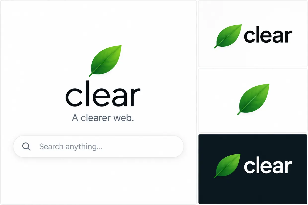
The Clear brand board, October 2026.
The mark is a single green leaf, pointing up and to the right, stem at the lower left. It stands for the whole idea: something alive, growing, and unjunked. The leaf is never placed inside a circle, a badge, or a box. The old green dot is retired.
The markClear space: keep a margin of at least half the leaf's height on every side.
Minimum size: 24 px on screen, 8 mm in print. Below that, use the word on its own.
The leaf's color is part of the leaf. It is a photograph of green, not a flat swatch. Never recolor it, outline it, shadow it, or rotate it.
Three lockups cover everything. The stacked lockup is the front door: leaf above the word, tagline beneath when there is room. The horizontal lockup is for headers, footers, and anywhere height is scarce. The reversed lockup is the same pair on dark, with the word in white and the leaf unchanged.
clearclearNever: put the leaf back in a circle, stretch or condense the word, set the word in another typeface, add a period to the wordmark, capitalize it, or translate it. The word is clear, lowercase, in every language.
Green for life, near-black for words, grays for quiet. Sampled from the leaf itself and from the pages it lives on.
The wordmark is the system sans at weight 500, lowercase, letter-spacing -1.5 to -3 depending on size. No custom font, no license, loads instantly, and it is the same type the pages are written in. That is on purpose: the brand is the product.
Headlines are the same sans at 700 or 800, tight tracking, short enough to read at a glance. Body text is the same sans at 16 to 18px with generous line height; long reads elsewhere in the family may set Georgia. Labels are monospace, uppercase, letter-spaced, small, and gray.
The brand is Clear. Never Clearr, never CLR, never Clear FM. The address is clr.fm, the shortest honest address we could find, and it is fine for the address to be shorter than the name. The tagline is "A clearer web." Nothing else is the tagline.
Take the mark and use it kindly. These are the only official files.
Clear is being set up as a non-profit. 100% of the money goes to orphanages in South America.